Back to Work
Operating System Scheduling Simulator
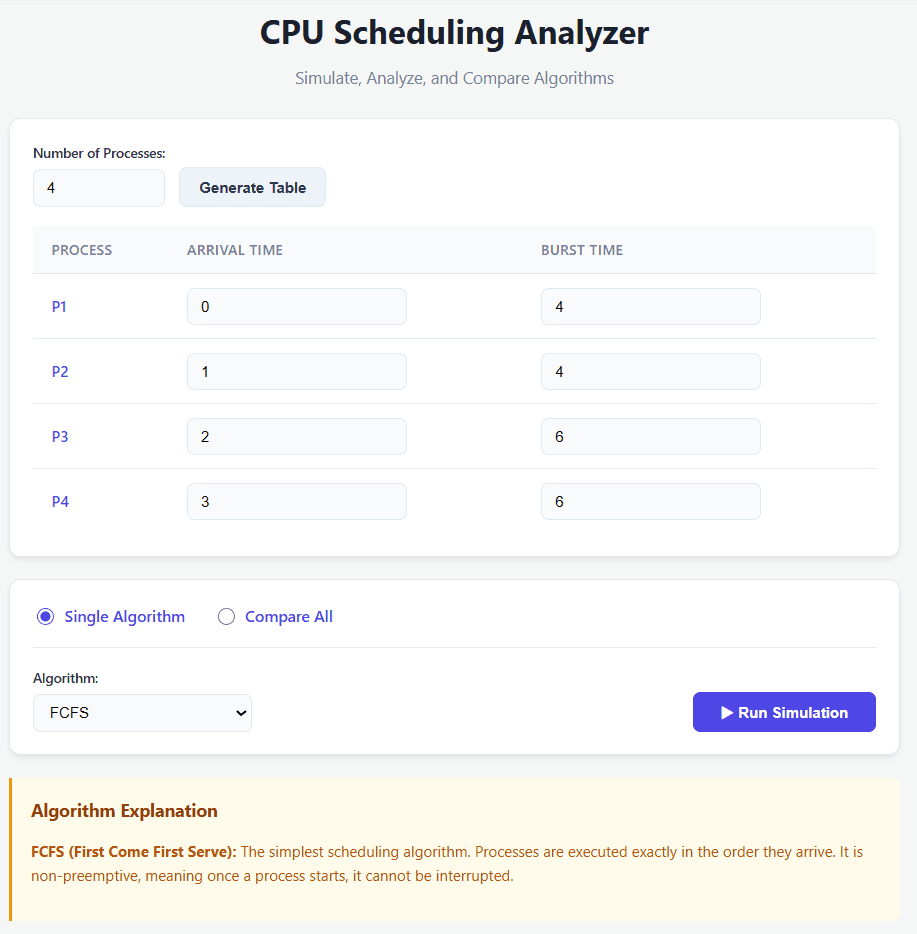
ShippedAn interactive visualization tool simulating FCFS, SJF, Round Robin, and Priority CPU scheduling algorithms with animated Gantt charts.
- HTML
- CSS
- JavaScript
The Problem
I wanted to understand why different CPU scheduling algorithms produce radically different performance profiles under the same workload. Textbooks explain FCFS, SJF, Round Robin, and Priority Scheduling with throughput tables and turnaround-time averages, but those numbers never made me feel the scheduling decisions the way watching a Gantt chart animate did.
What It Does
Architecture & How It's Built
Decisions & Tradeoffs
- **Visualization is a thinking tool, not just a presentation tool**: Watching a Gantt chart stretch and compress under different algorithms made the textbook formulas click in a way they hadn't before.
- **Tradeoffs over one-size-fits-all**: FCFS works well for long jobs but punishes interactive processes. SJF minimizes wait time but requires future burst length prediction. Round Robin ensures fairness but incurs context switch overhead.
- **Vanilla JS over UI Frameworks**: Kept the codebase small and portable without build tools or framework overhead.
Roadmap & What's Next
- Adding Multi-Level Queue (MLQ) and Multi-Level Feedback Queue (MLFQ) algorithm support.
- Simulating realistic context switch time overhead penalties.
Technology Stack
HTML
CSS
JavaScript
Quick Links
Started Last updated